



Brand appearance
One colour, two fonts and a logo, applied to every document and customer-facing page at once.
At the top of Settings → Organization sits Brand appearance. Set it once and your documents, booking pages and customer portal all follow.
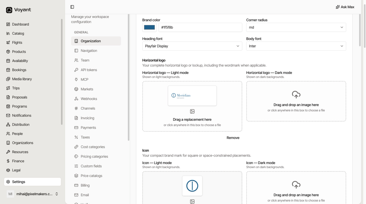
The four settings
- Brand color, your main colour. Pick it with the swatch or paste a hex value.
- Corner radius, how rounded buttons and cards look. Small feels formal, large feels friendly.
- Heading font and Body font, chosen from a list.
A serif heading with a plain body, as in the example above, is a safe combination that suits most travel brands.
Logos come in pairs
Each slot has a Light mode and a Dark mode version.
Your normal logo goes in Light mode. If it is dark blue or black, it disappears on a dark background, so upload a pale version to Dark mode as well. If your logo already works on both, upload the same file twice.
The three kinds
- Horizontal logo, your full lockup with the wordmark. Used at the top of documents and pages.
- Icon, the compact mark on its own. Used where a wide logo will not fit.
- Favicon, the little icon in a browser tab.
File requirements
PNG, JPEG, WebP or GIF, up to 2 MB each. A transparent PNG or WebP gives the cleanest result, because it sits on any background without a white box around it.
Make the favicon square, or it gets squashed.
Replacing one
Click a slot that already has an image and choose a new file, or use Remove underneath.
Did this answer your question?
Thanks for your feedback.